A monochromatic outfit does not mean one color repeated five times. It means one color family, worked across several tones, textures, and finishes so the eye keeps finding something new. Done well, it reads as deliberate and calm. Done lazily, it reads flat — and the difference is technique, not the color you picked.
The good news is that the technique is learnable, and it costs nothing. You are not buying a new wardrobe. You are recombining what you already own by shade and surface instead of by category, and letting small differences in tone do the work that contrast usually does. If you have read our piece on texture contrast: the styling tool that works when color can't, some of this will feel familiar — texture is one of the three levers, and arguably the most important one. This connects to our earlier piece, Texture contrast: the styling tool that works when color can't.
What does "monochromatic" actually mean?
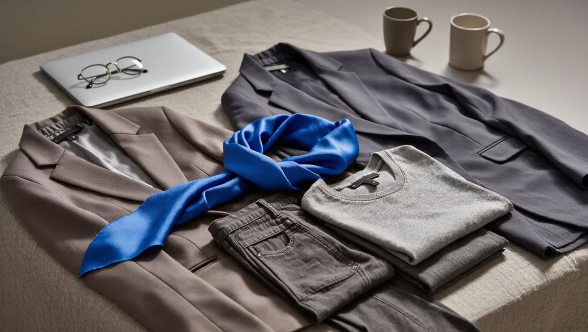
Strictly, monochromatic means variations of a single hue: a navy shirt, mid-blue jeans, a pale blue overshirt. In practice, most people who dress this way allow near-neighbors too. A slate gray knit with charcoal trousers and a black boot still reads as one idea, because the hues sit close on the wheel and the eye groups them.
That grouping is the whole point. When every piece belongs to the same family, the outfit's outline becomes the main event. Shape, drape, and proportion stop competing with color for attention. This is why the look photographs well and why it survives trend cycles — the same reason we argued that silhouettes date faster than colors, and a single-hue outfit puts silhouette front and center.
Why does it look flat, and how do you fix it?
Flatness comes from sameness in two dimensions at once: same tone and same surface. Fix either one and the outfit wakes up. Fix both and it looks composed. For related coverage, see The case for one good coat, argued once and properly.
Start with tone. Aim for at least two steps of lightness between your pieces — say, a deep forest green trouser under a lighter sage knit. If everything sits at the same value, the body becomes one block. A lighter shade near the face also does quiet flattering work, lifting the complexion without any contrast at all.
Then break the surface. This is where texture earns its keep:
- Matte against sheen: a flat wool trouser under a softly shiny satin blouse.
- Rough against smooth: brushed mohair over clean poplin, or raw denim under fine merino.
- Structured against fluid: a crisp jacket over a drapey slip dress.
Finish matters too. A matte shoe under a shiny hem reads differently than the reverse. You are not adding color; you are adding light behavior, which the eye registers as depth.
What this means for how you build the outfit
Work in a sequence rather than hunting the closet at random. Our approach, tested against many mornings of getting dressed:
- Pick the anchor. Usually the hardest piece to replace — good trousers, a knit you love, a coat. Build around it, not from the top down. The same logic as starting with the shoes applies: the least flexible piece sets the terms.
- Step the tones. Lay candidates next to the anchor and keep only pieces that are visibly lighter or darker. If you have to squint to see the difference, swap it.
- Vary two surfaces minimum. At least one matte and one non-matte. Add a third texture if the outfit still feels even.
- Check the outline. One hue hides seams, so proportion carries more weight. A cropped layer over a longer one, or a defined waist, keeps the body from becoming a column. Our piece on why proportion, not price, holds an outfit together covers this in depth.
- Decide on the break. A belt, a visible sock, a metallic accessory — one small interruption can sharpen the whole composition. Or skip it and let negative space do the work, as in what to remove so an outfit can breathe.
Which colors are easiest to start with?
Neutrals are the forgiving entry point. Cream, camel, chocolate, and charcoal all have wide tone ranges in most wardrobes, and near-neighbors blend gracefully. Navy is another strong start: pale blue, mid denim, and deep navy are usually already in the same drawer.
Bolder hues need a lighter hand. With red or emerald, keep the tone steps gentle and lean harder on texture, because large tone jumps in a saturated color can look accidental rather than styled. Darker, muted versions of a hue are also more forgiving than bright ones — they photograph as one family even when the shades drift.
Fit is the last gate, and it applies no matter the palette. Because nothing in a single-hue outfit distracts, a shoulder that sits wrong or a hem that pools becomes more visible, not less. Fit is a skill, not a body type — and a simple hem or taper is often the cheapest upgrade in the whole method.
Our analysis: why the look endures
The case for monochromatic dressing is ultimately a case about attention. A single color family removes one decision, reduces visual noise, and pushes the eye toward cut, texture, and how clothes move on a body. That is why it flatters across budgets and body types: the method asks nothing about what you spent or what shape you are, only about how the pieces relate to each other.
What the evidence of practice establishes is this: depth comes from tone steps, surface variety, and proportion — not from the color itself. What remains genuinely individual is taste in texture and the confidence to let an outfit be quiet. Start with one family already in your closet, step the tones, break the surfaces, and the "boring" reputation dissolves on contact.