Color analysis is the practice of testing which colors sit well against your skin, hair and eyes. You can do a usable version of it at home in an afternoon with daylight, a plain wall and a pile of clothes. The core question is simple: does this color make my face look brighter, or does it pull the color down and out?
The method below is a draping test, the same move a consultant makes with fabric swatches, done with things you already own. It works because color is relative. A shirt never looks the same on a hanger as it does against a jawline. What changes is contrast, warmth and depth — and those three dials are what you are actually testing.
Before the steps, one framing note. This is a style skill, not a rule system. The result is a palette that flatters most days, not a law about what you're allowed to wear. If you love a color that fails the test, wear it away from your face — a bag, a shoe, a skirt.
Why daylight is the only honest light source
Indoor light lies. Warm bulbs add yellow, cool LEDs add blue, and both will push you toward the wrong season. The fix is free: do the test next to a window on a clear day, mid-morning or mid-afternoon, with the light hitting your face from the side rather than straight on. Avoid direct sun, which flattens shadows and hides how a color sits on the skin.
Turn off the room lights while you test. If you must do this in the evening, accept that your results are provisional and recheck the borderline colors the next day. Makeup matters too — test on clean skin, because foundation and blush are colors competing with the drape.
What you need for a home draping test
Gather four things:
- A window with indirect daylight and a plain, light-colored wall behind you.
- A phone camera, for the mirror-averse. Photos also let you compare drapes side by side later.
- Two large solid-color fabrics or garments: something warm-toned (a rust, camel or tomato red) and something cool-toned (a blue-red, a slate blue or a cool pink).
- Your own closet, sorted into two piles: colors you'd call warm and colors you'd call cool.
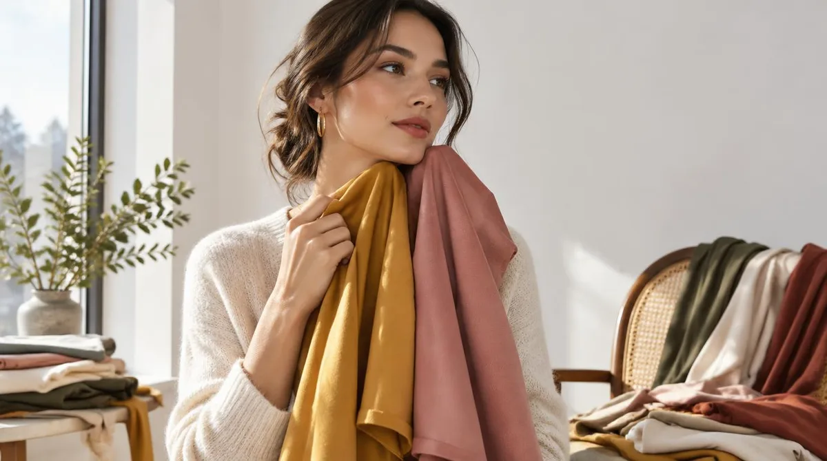
White towels work as neutral drapes if you lack big fabric pieces. A white bathrobe collar held up under the chin does the same job. The drape should be large enough to fill your lower field of view — a scarf is too small to judge fairly.
How to run the drape test, step by step
- Neutralize the background. Stand or sit at the window, hair pulled back or pinned off the face, no jewelry. If your hair is a strong color, a plain headscarf in gray keeps it from voting.
- Hold the warm drape under your chin. Let it cover your chest and shoulders. Look at your face, not the fabric. Ask: do my under-eyes look lighter or darker? Does my skin look even, or does redness and shadow jump forward?
- Swap to the cool drape. Same position, same question. The difference is usually visible within seconds. One of the two will make your face look more awake; the other will make shadows read as tiredness.
- Test depth next. Take the winning temperature and pair it with a very light version and a very dark version of a similar color. If the lighter one makes you look washed out and the darker one makes you look sharp, you carry depth well and should buy saturated, darker colors. If the reverse, aim lighter.
- Test contrast last. Hold up a high-contrast pairing (say, black against white) near your face, then a low-contrast pairing (cream against camel). Whichever feels calmer tells you how much contrast your own features carry — a dial we've covered separately in Contrast levels: the quiet dial that changes any outfit.
- Photograph each winner. Same framing, same light, every time. Lining up four photos later is how you see the pattern your eyes kept half-noticing.
Skip the temperature test entirely if you already know it — plenty of people can name warm or cool on sight. Start at depth. The test takes twenty minutes when you're decisive and an hour when you're not. Both are fine.
Reading your results without a season chart
The classic seasonal system sorts people into four named palettes, but you don't need the label to use the finding. Three answers are enough to shop with:
- Temperature: warm or cool. This decides undertones — whether a red should lean orange or blue, whether a white should be cream or stark.
- Depth: light, medium or deep. This decides how dark your best colors go before they start wearing you.
- Contrast: high or low. This decides whether crisp pairings or blended ones look more natural on you.
Write your three answers on a note in your phone. That sentence — "warm, medium depth, medium contrast" — is your palette in compressed form, and it travels to the store better than any season name does.
Building a palette from your three answers
Now translate the finding into clothes. Start with neutrals: pick the white, the dark neutral and the mid-tone that match your temperature reading, and let those carry most of your wardrobe. Then add two or three accent colors in your winning temperature at your depth. That's a working palette — six to eight colors that all cooperate with each other and with your face.
Here the digital color vocabulary becomes genuinely useful. According to HTML Color Codes, a shade is a base color mixed with black, a tint is a base mixed with white, and a tone is a base mixed with gray, which softens its intensity. That's exactly the move to make when a color you love is almost right: if tomato red overwhelms you, try a tone of it — the same hue with gray added — which keeps the warmth but lowers the voltage. The same reference counts the possible hex codes at 16,777,216, which is a useful reminder that "my color" is never one swatch. It's a neighborhood, and you're looking for the block you live on.
Once the palette exists, the rest of dressing applies as usual. A single-hue look built from tints and tones of one of your winners reads as deliberate rather than flat, which is the whole argument of Monochromatic dressing: building depth within a single hue. And when a great color in your palette starts to feel one-note, texture does the work color can't — the case we made in Texture contrast: the styling tool that works when color can't.
What this means for how you shop
A tested palette changes purchasing in one concrete way: you stop buying color on impulse and start buying it on fit-with-your-face. Hold any candidate up near your chin in the fitting-room light and ask the draping question. If the store light is bad, judge the color's temperature and depth against your phone note instead — those two attributes survive bad lighting better than the overall impression does.
It also changes what you keep. Colors that fail the test but hold sentimental value don't need to leave; they need to move away from the face. A failing scarf can become a bag. A failing blazer can be worn open over a winning top, so the color frames the outfit rather than the jawline. The palette is a tool for placement, not a purge list.
What the test establishes is which colors make your face read brighter and more even under honest light. What it can't establish is taste, and it shouldn't try. Wear the outliers when the mood asks for them — just know which colors are doing the flattering when you want the outfit to work quietly.