Squint at any outfit and color disappears; what survives is contrast — how far the pieces sit from each other on a scale from dark to light. Black trousers with a white shirt is high contrast and reads crisp and assertive; gray on cream is low contrast and reads soft and quiet; the wrong dial setting for the person wearing it reads as either costume or invisibility. This column argues that contrast is the most under-discussed variable in everyday dressing: it changes an outfit's message more than hue does, and it is fully adjustable with clothes you already own.
We should note the desk's limits. This is a compositional framework, not a rule about anyone's coloring; the often-quoted seasonal color systems of the 1980s pushed contrast advice toward personality typing, and we leave that where we found it.
What is contrast, measured how?
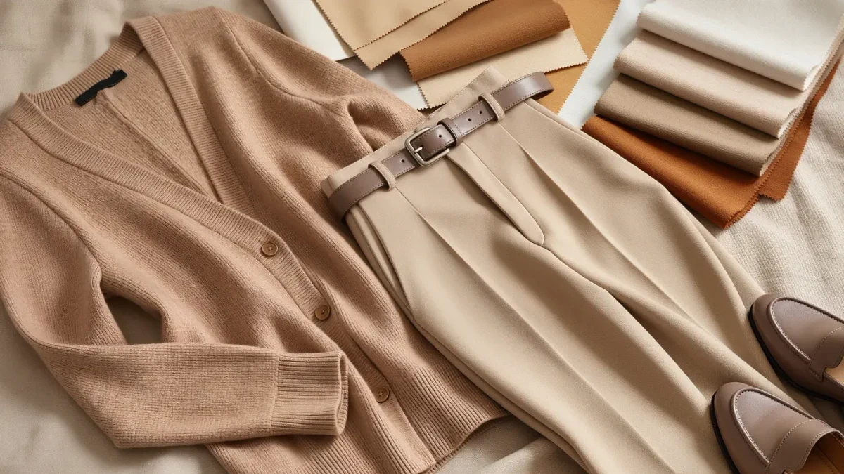
Think in three settings. High contrast pairs light against dark with nothing in between — the white shirt and black suit, the ivory knit over dark denim. Medium contrast pairs dark with mid-tone or mid-tone with light — charcoal over gray, navy against tan. Low contrast keeps everything within a narrow band of value — cream, oatmeal, and soft brown together; tonal black-on-black. Fashion illustration and costume design have long used value sketches precisely because a figure's contrast structure is legible without any color at all.
The same outfit can shift its entire reading by moving one piece one step. Swap a white shirt for a pale blue one under that black suit and the look softens a full setting; the suit did not change, the message did.
Why does contrast read as mood?
Because the eye processes value before hue. Edge detection in human vision keys on lightness differences first; that is why black-and-white photographs still carry full emotional information. High-contrast outfits generate hard edges — graphic, decisive, unmissable. Low-contrast outfits generate soft transitions — restful, elongating, self-effacing. Neither is superior. A courtroom and a candlelit dinner reward different dials, and most style confusion between people who own similar clothes traces to wearing the wrong setting for the room.
Should contrast match your natural coloring?
The honest, useful version of that old question is about harmony rather than rules. A person whose features carry naturally high distinction — deep against light — tends to look settled in high-contrast clothing, which echoes what is already there; a person whose coloring sits in a narrower band often finds mid and low contrast more restful. But this is a default, not a sentence. Intentional mismatch is a styling device with a long history: artists' portraits deliberately break harmony to direct attention. The practical guidance is to know your natural setting so that any departure from it is a choice.
Offices demonstrate the dial daily. Rooms with a quiet dress code run on medium and low contrast — charcoal over gray, navy over tan — where high contrast reads as the loudest person present. Creative rooms invert the math, using high contrast as a deliberate signal against a sea of tonal dressing. The same garment behaves differently in each: a crisp white shirt is a neutral in the first context and a statement in the second. Context, not the garment, sets the correct setting — which is why borrowing a look wholesale so often fails and why the same clothes restyled at a different contrast level can rescue it.
How do you adjust contrast with what you own?
Four levers, no purchases required. First, the layer next to the face matters most; changing only the shirt or scarf shifts the whole reading because that is where viewers look. Second, footwear and outerwear frame the outfit — dark shoes and a dark coat deepen contrast, tonal ones quiet it. Third, patterns carry their own internal contrast: a small tone-on-tone print behaves like low contrast even in a dark color, while a graphic stripe imports hard edges. Fourth, when an outfit feels loud but you like every piece, remove contrast rather than pieces: swap one extreme for its mid-tone neighbor and the look settles without changing its idea.
The close returns to the thesis. Color chooses what an outfit says; contrast chooses how loudly it says it. Before you buy anything to fix a look that is not working, ask whether the dial is simply set wrong — light against dark, soft against soft — and turn it one notch.
Sources for this piece include Library of Congress digital collections.