Limit an outfit to three colors and something specific happens: the eye stops counting and starts reading. That is the entire mechanic behind the three-color rule, one of the oldest shorthand rules in personal styling — and the reason it keeps resurfacing decade after decade. This column argues the limit is worth keeping, not as law but as a legibility device: color is information, and every additional hue taxes the viewer's attention before your silhouette, fabric, or fit gets a word in.
One qualification up front. We write about dressing as craft, not as a judgment on anyone's choices; plenty of memorable outfits break the cap on purpose. The point is to break it knowingly.
Why three, specifically?
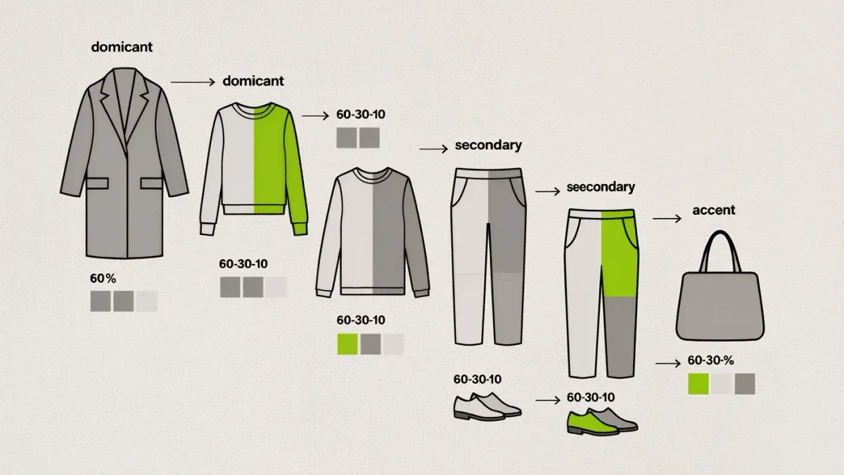
Because attention divides. In visual composition, the eye groups what it sees into a small number of clusters — usually three to five — and assigns weight to each. One color dominates, one supports, one accents. With three colors the viewer's brain completes this sorting in under a second and moves on to the cut, the drape, the details: the parts that carry taste. Add a fourth and fifth distinct hue and the sorting never quite settles; the outfit reads busy even when every piece is well made. style coverage.
The cap also does quiet structural work. When repeats are limited, pieces link to each other — the scarf picks up the shoe, the bag picks up the belt — and linkage is what makes an outfit feel composed rather than assembled. Interior designers use the same ratio in rooms: a dominant tone, a secondary, an accent, roughly at 60-30-10. The numbers are folklore rather than physics, but the underlying observation is sound: hierarchy beats equality in color as in composition.
What counts as a color?
Here is where the rule flexes, correctly. Neutrals with no clear hue — black, white, ivory, gray, most camel — behave as a background rather than a color, which is why an ivory tee, dark-wash jeans, and a camel coat can carry a green scarf and still feel like a two-color outfit. Denim gets similar leniency in most stylists' reading; it functions almost as a neutral. The practical version: count saturated and clearly hued colors first, treat the quiet stuff as infrastructure.
Texture complicates the count in the other direction. Two colors in wildly different textures — a matte wool and a glossy leather, say — register as more varied than four colors in the same flat cotton. If you want to push past three, push texture, not hue.
How do you apply the cap without looking stiff?
Three moves cover most cases. First, build from the dominant color — usually the largest garment — and let the second share its temperature family so the base feels settled. Second, spend the third color deliberately: shoes, bag, or one knit layer, not all three at once. A single red accent repeated twice in an outfit reads as a decision; the same red appearing four times reads as a theme park. Third, when in doubt, replace a color with a tone — navy against black, cream against white — which adds depth without adding to the count.
The limit also has a shopping dividend that rarely gets mentioned: closets governed by a loose three-color palette have dramatically higher outfit yield per piece, because more of what you own talks to more of everything else. Fewer orphan garments, fewer dead purchases. The cap is a closet policy as much as a mirror rule.
When breaking the rule is the right call
Color blocking works precisely because it is a confident violation: two or three saturated colors, flat finishes, clean cuts — the intention is legible even without hierarchy. Print complicates the arithmetic; a multicolor print counts as one color for practical purposes, and pulling its accent shades into solid pieces is the classic way to keep the whole thing coherent. The rule exists so you know what you are doing when you break it.
Thesis restated: the three-color limit is a legibility device, not a verdict. Three colors let your fit and fabric speak; more colors make color itself the whole message. Decide which message you want before you dress — that is the whole discipline.
Sources for this piece include BBC Culture's coverage of color and design.