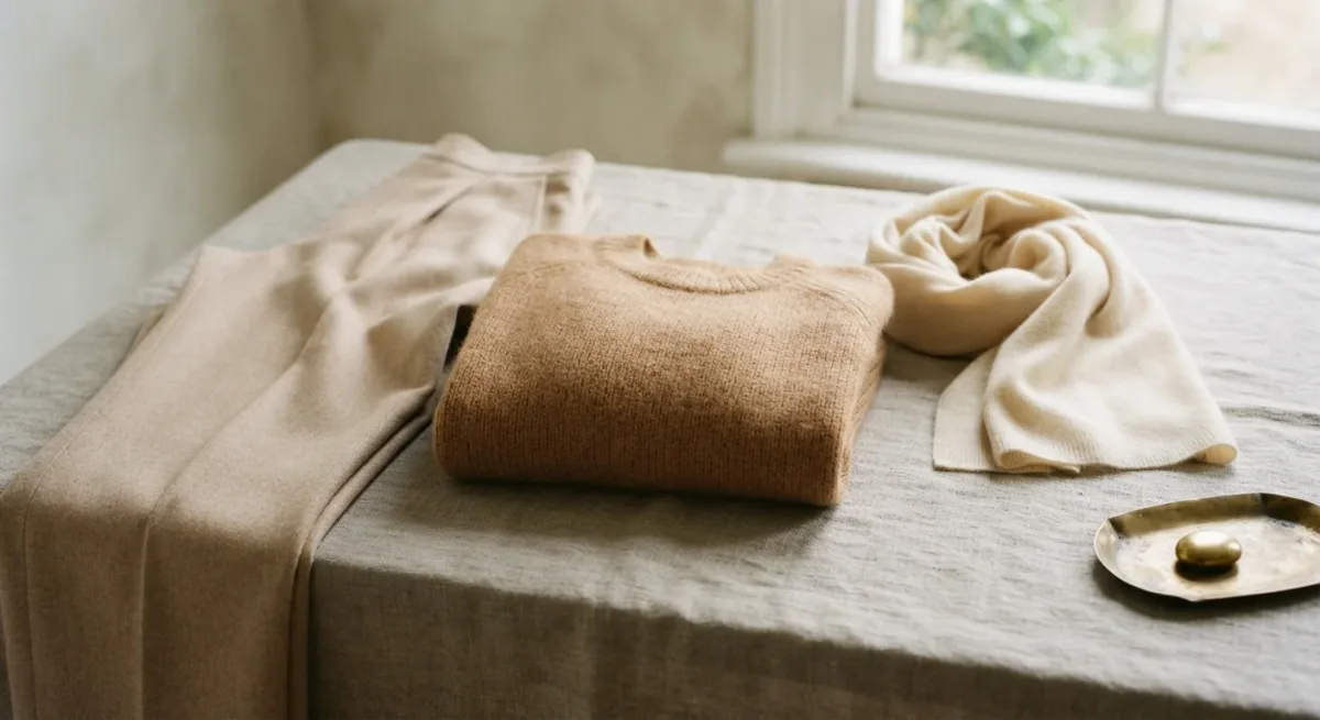
A one-color outfit works when three variables move while the color stays still: tone (light to dark), texture (matte to shine), and proportion (fitted to voluminous). This is exactly how painters handle a restricted palette — Vermeer's Woman with a Pearl Necklace (c. 1664, Gemäldegalerie, Berlin) is nearly a lesson in it: one warm neutral range, several surfaces, one small point of light. Dress a monochrome look the same way and it reads deliberate rather than costume.
This is a technique tutorial — composition logic you can apply to any color and any budget. The steps below are numbered so you can run them at the rail.
Which color should you start with?
Start with a neutral you already own most of: navy, gray, camel, olive, black. The reason is arithmetic — a one-color outfit needs three to four pieces in a workable tonal range, and the chances of finding them in one session are highest in the color your wardrobe already favors. Mid-range tones give you the most room: navy can go to near-black and to washed chambray; camel runs from cream to dark caramel. A saturated color — a red or cobalt — is a harder opening hand, because most wardrobes hold one or two pieces in it, not a range. Saturated single-color looks read best when one piece carries the full intensity and the rest stay quieter relatives.
What are the steps?
Five, and the fourth is the one everyone skips.
- Pick the anchor piece. The largest block of color in the outfit — trousers, a skirt, a coat. Fix its tone first; everything else negotiates around it. Note the fabric: an anchor in a flat matte cloth (wool flannel, heavy cotton) makes tonal variation above it easier to see.
- Build the tonal range. Choose the next one or two pieces at a visible distance from the anchor's tone — not the same, not opposite. Same-tone pieces merge into a jumpsuit effect; that works only when textures differ sharply. If in doubt, step lighter as you move away from the body's center: darker low, lighter high, one exception allowed.
- Vary texture deliberately. This is what stops a monochrome outfit reading flat: smooth against knit, crisp against soft, matte leather against brushed wool. Two textures is a minimum, three is ideal, four starts to fuzz. A tonal outfit where every surface is the same cotton is the one that looks like a uniform by accident.
- Place one break. A point of contrast — skin at the ankle or wrist, a white tee hem, a metal watch, a different-color shoe — gives the eye somewhere to land. Vermeer's pearl again: a square centimeter of contrast carrying the composition. Skip this step and the outfit reads as one continuous mass; the break is what makes it an outfit.
- Check proportion last, in the mirror, at distance. Monochrome erases the horizontal lines that break up a multi-color outfit, so the silhouette carries everything. Look for one volume statement — a wide trouser, an oversized knit — balanced by something fitted. Fitted everywhere reads formal; voluminous everywhere swamps. Two meters from the mirror is the honest viewing distance; that is roughly how others see you.
How do accessories and shoes fit in?
Two coherent strategies, and mixing them is the common failure. Strategy one: shoes and bag inside the tonal range — the full monochrome, drama through silhouette alone. Strategy two: neutral footwear outside the family (black with camel, dark brown with navy) acting as the break from step four, with metal jewelry as the counterpoint. What doesn't work is a third hue competing with the main one — an outfit built around camel does not want a burgundy bag; it wants a repetition of caramel or a clean exit. Belts repeat the shoe color or vanish into the anchor piece; a contrast belt slices a tonal column in two.
What are the common mistakes?
Four recur. Nearly-identical tones in the same fabric — the outfit becomes shapeless; change one or the other. Black-on-black done in clashing blacks — one warm, one blue-black — which photographs as mismatched; hold the pieces under the same light and reject any that fight. All one texture, covered above. And skipping the break, then feeling the outfit is "too much" without being able to name why — it is nearly always the missing point of contrast. A monochrome outfit is finished by what is not in the palette.
Does this work for every color and season?
Yes, with a seasonal adjustment: winter monochrome leans on heavy textures — flannel, cashmere, leather — and can run darker; summer versions live on tonal linen, washed cotton, and paler ranges, where the texture variation has to work harder because the tones are closer. And the technique transfers completely to prints: a print that contains your anchor color can join the outfit as a texture variant, provided it repeats the tone of something already in the look. Hold the hue, move everything else — that is the whole method.
For more context, read How to Layer Your Skincare Products in the Right Order.